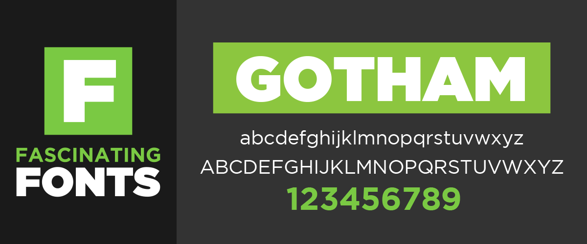
Gotham is a geometric sans-serif typeface inspired by lettering from mid-twentieth century New York City. It was initially commissioned by GQ magazine, who was looking for a fresh new look for their magazine. Looking to create a typeface that was masculine and had a geometric structure they hired American type designer Tobias Frere-Jones in 2000.

Gotham has an extremely large font family and is very legible from a distance due to its wide width and geometric structure. After using it for a few years I can say that this font works well in almost any situation where you want a modern, architectural feel. I love to use the “ultra” weight as a header and compliment it with either the “book” or “light” weights. Being a relatively wide typeface I tend to stray away from it when I don’t have a lot of horizontal room but that is the only downside I have found. Two things I really like about Gotham is the straight legs on the capital R and the unique center shape of the lowercase a.

Being such a beautiful font, Gotham found its way into American culture very quickly. Gotham was used regularly during the Obama presidential campaign in 2008 as well as the 2016 federal election campaign. It was used on the cornerstone of the Freedom Tower at the World Trade Center site and is currently the font used for the MPAA title cards for film trailers in the U.S.

Other entities to use Gotham include: Coca-Cola, Saturday Night Live, Starbucks, Michigan State University, New York State University and the Georgia Governor’s office of Customer Service! It was also used by Netflix until 2018 when they created their own typeface to reduce expenses and create their own style.

If you don’t mind the fact that Gotham is everywhere it is a great free font to add to your arsenal. A great idea would be to pair Gotham with a script typeface as a sub header to help bring a unique feel to an often used font. Also, using the plethora of weights can give your design a unique flavor. Most people don’t know fonts by name they just know when something looks good. And anything you create with Gotham will look good!
FONT RATING A- | BEST USE: ANY AND ALL | BIGGEST DOWNFALL: USED OFTEN
Here at Wilde Signs we set the bar high by offering our customers superior quality at a competitive price, paired with fast delivery.
Custom sign projects & manufacturing is our specialty. Don’t be overwhelmed by creating a solution on your own. Pass your projects off to us and we will see it through to outstanding results–beginning to end.
The Wilde Signs Promise You will receive an end product that you are happy with or we will make it right.
Leave A Comment