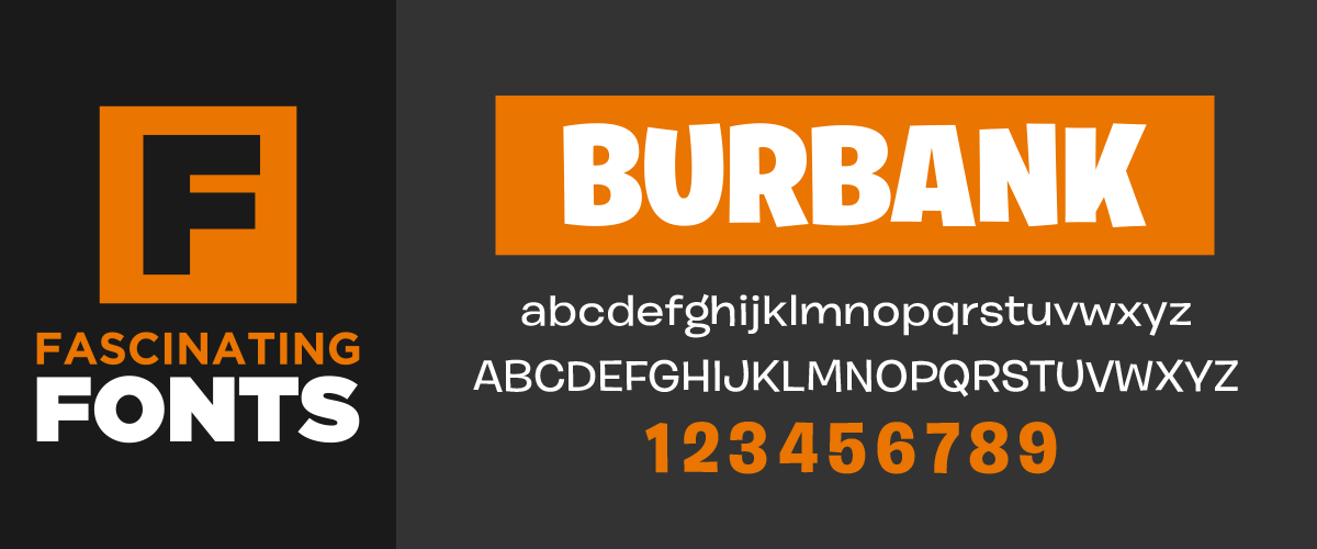
There are so many good free fonts available these days you can almost get by with never buying any. But… if you were going to purchase 1 font I would most certainly tell you it should be Burbank! When it comes to fonts Burbank is in a class of its own.
How it Came to Be
Burbank was the brain child of Tal Leming from House Industries. Back in the early 2000’s Tal noticed that there was a lack of animated typefaces that were anything more than single, stand-alone fonts and he decided to do something about it. He started the decade long process of developing the intricate aspects of Burbank with a lot of thought and care. What came out of that is a font that is so well designed it is almost flawless.

A Visual Masterpiece
Burbank can best be described as an animated font, meaning it’s roots go back to animation style lettering that uses bent lines, uneven letter bottoms and usually deformed circles. All this works together to create an energetic typeface that is fun and brings out childlike qualities. The thing I find most interesting though is, even though it is an animated font it still has an elegance and professionalism to it. It’s like the best of both worlds or to put it another way… business in the front, party in the back!

Plenty of Variation
Burbank is broken into 4 weights of 5 styles. Burbank Regular, Condensed & Wide are all variations of the Burbank “Big”, while there are also “Small” and “Small Italic” styles. The “Small” style is not a direct duplicate of the “Big” style; rather it was modified to increase legibility at small sizes. Another interesting fact is Burbank “Big” uses OpenType magic to automatically add different variations of the same letter to eliminate shape repetition! This means that multiples of the same letter will not be identical thus making the type look more like a creation rather than a font.

When to use Burbank
Burbank is my go to font when I want to add a little play to my text. I love to use it for product advertising or any sign designed to capture the attention of a child. You can use the 4 different weights to really separate headings from secondary text and things like that. “Wide” is a great option for when you have a lot of horizontal space to fill.

Burbank is a great font that I highly recommend. It does have a price tag though so you need to be willing to part with some cash. If you are designing for profit though the price you pay is well worth it in my opinion. One positive of fonts you have to purchase is that you will see them used less especially among non professionals which will help set your design apart.
FONT RATING A+ | BEST USE: ANY AND ALL | BIGGEST DOWNFALL: Paid Font
Here at Wilde Signs we set the bar high by offering our customers superior quality at a competitive price, paired with fast delivery.
Custom sign projects & manufacturing is our specialty. Don’t be overwhelmed by creating a solution on your own. Pass your projects off to us and we will see it through to outstanding results–beginning to end.
The Wilde Signs Promise You will receive an end product that you are happy with or we will make it right.
Leave A Comment