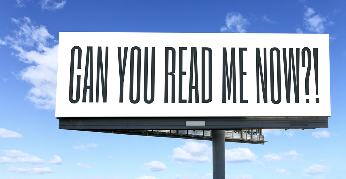
Want to make sure that your next sign is a high impact money maker? There are plenty of mistakes that can be made to lower a signs effectiveness, but I wanted to highlight one design aspect that is commonly not given enough thought, and that is choosing the correct text size required to be readable from the average viewing distance.
I know this sounds like a boring subject, but it is so important and you would be surprised how many times this does not get factored into sign design. If a sign cannot be read it will have zero impact. Follow the recommendations and guidelines below to make sure that your next sign reaches it’s maximum potential!
The Golden Rule for Sign Letter Height
There are a few factors to consider when deciding on a signs lettering height, like lighting, sign contrast, speed that people will be passing your sign, but a great rule of thumb is to have your letters at least 1 inch high for every 10 feet of what you determine will be the average viewing distance. Another way to run the math is to divide your average viewing distance by 10. This is a great way to get a sign’s text in the ballpark so to speak.

Real World Examples
Yard Signs
A typical yard sign is 24″ by 18″ sitting atop a 15″ yard stake and has an average viewing distance of 30′-50′. Using our formula above you would want to consider keeping your smallest text 3″ tall and your main text around 5″.
Window Graphics
Window Graphics have an ideal viewing distance of around 40-60 feet. In this case we would want to keep our text at least 4″-5″ tall.
Sidewalk Signs
Sidewalk / Roadside Signs generally use inserts around 24″ – 28″ wide. Considering the speed of traffic we can guess that average viewing distance will be around 50 feet away. A safe bet would be to keep all of our “must read”verbiage at least 5″ tall. If traffic is traveling at a high rate of speed that minimum letter height might want to be set at around 6″ or 7”.
Banners
Most outdoor banners range from 8′ – 12′ wide and have an ideal viewing distance of around 80-100 feet. In this case we would keep our smallest text at least 8″ tall.
Building Signs
Building Signs need to be read from a distance of at least 120 feet. Keeping your sign lettering to at least 12″ tall would be a smart idea.

Other Recommendations
Always Round Up
Whenever possible it is always a smart decision to round up with both your letter height and viewing distance because it is always better for text to be too large rather then too small.
Factor in Rate of Travel
If your potential viewers are passing your sign at a high rate of speed consider doubling your original average viewing distance, or just make your text as large as possible without ruining the sign design!
Design Your Sign Around The Text
While there are many important aspects of a sign design, the most important part is usually the message. We recommend starting with a simple background and your text before moving on to other elements. This gives you a blank canvas to give your message first attention.
Use Contrasting Colors
Make sure there is plenty of contrast between your sign text and the background. Contrast happens when you use a light color on top of a dark color, or vice versa.
Consider Lighting Conditions
Both low light and direct sunlight can drastically reduce contrast. When your sign needs to be viewed in either of those conditions use high contrasting color schemes and increase your text size as much as possible.
Consider Sign Surroundings
Not only is it important to have contrast on your sign but also between your sign and its surroundings. Take note of where your sign will be placed and use contrasting colors in the design to help it stand out and be noticed.
Leave A Comment